Introduction
At Gem Punch, we believe embroidery is more than decoration—it’s a language stitched in color. From the fiery reds of a sports patch to the calming blues of a wellness brand, every hue tells a story. The Psychology of Color in Patch and Embroidery Design, isn’t just thread; it’s an emotional tool that shapes perception, strengthens brand identity, and makes designs unforgettable.
What Is Color Psychology?
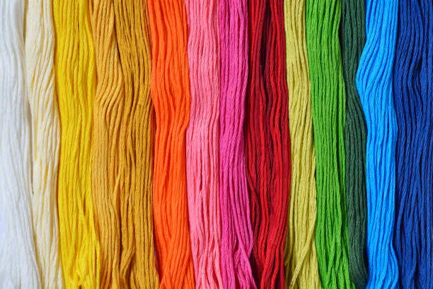
Color psychology studies how colors influence emotions, behaviors, and perceptions.
While interpretations may shift across cultures, some associations are widely recognized:
- Red – Passion, urgency, excitement
- Blue – Trust, calm, stability
- Green – Growth, balance, nature
- Yellow – Happiness, optimism, attention
- Black – Sophistication, power, elegance
- White – Purity, simplicity, clarity
When applied to embroidered patches, these meanings are magnified. The tactile, tangible nature of Gem Punch designs makes every color choice even more impactful.
Applying Color Psychology to Patches & Embroidery
In Gem Punch’s custom embroidery work, colors go beyond aesthetics—they set the tone for the entire message:
- Warm tones (reds, oranges, yellows) energize and demand attention—ideal for team spirit patches, promotional events, or bold brand campaigns.
- Cool tones (blues, greens, purples) soothe and reassure—perfect for wellness industries, educational programs, and service brands.
- Neutral palettes (black, gray, beige) bring timeless sophistication—suited for uniforms, heritage branding, and high-end merchandise.
Even subtle shifts in shade—like a soft pastel versus a vivid primary—can completely transform the feel of a design.
Design Techniques for Emotional Effect
1. Complementary Colors for Bold Contrast
Pairing colors opposite each other on the wheel (e.g., blue and orange) creates high visual impact, making patches stand out from a distance.
2. Analogous Colors for Harmony
Colors adjacent on the wheel (e.g., blue, teal, green) promote unity and flow—perfect for cohesive brand stories.
3. Triadic Schemes for Vibrancy
Using three evenly spaced hues (e.g., red, yellow, blue) ensures balance while maintaining energy.
Pro Tip from Gem Punch: Always test colors using actual thread samples. Lighting and thread texture can change how a color appears in the final product.
Emotional Engagement beyond Color
Color is powerful, but at Gem Punch, we know texture speaks too. Raised stitches in bold red can feel assertive, while smooth satin stitching in soft blue feels calming.
Custom embroidery also taps into nostalgia—scout badges, military insignia, or retro denim patches often evoke powerful emotional memories. Combined with color psychology, this tactile quality turns a design into a personal connection.
Practical Tips for Choosing Colors
- Define the Message first – Decide on the mood or story before selecting your palette.
- Research Cultural Meanings – Ensure colors align with your audience’s cultural context.
- Test Digitally & Physically – Use digital mockups, then confirm with real thread samples.
- Consider the Fabric Base – Background colors influence how embroidery threads appear.
- Highlight Intentionally – Use bright hues for focal points and muted shades for balance.
Conclusion
Your patch isn’t just a design—it’s a statement. At Gem Punch, we help you choose colors that tell your story, amplify your brand, and create lasting emotional connections. Whether you’re aiming to energize, inspire, or comfort, your color palette speaks louder than words.
Frequently Asked Questions
1. What is color psychology and why does it matter in patch and embroidery design?
Color psychology studies how hues affect emotions and behavior. For Gem Punch patches, the right colors not only look great but also shape the message and emotional impact.
2. How do cultural differences affect color perception in design?
Color meanings vary worldwide. For example, white represents purity in some cultures but mourning in others. Gem Punch helps tailor palettes for your audience.
3. How do complementary, analogous, and triadic schemes affect design?
Complementary colors create contrast, analogous colors create harmony, and triadic schemes balance vibrancy with cohesion.
4. Can color alone influence how a patch is valued?
Yes—designs that use color intentionally often feel more valuable due to the aesthetic–usability effect.
5. Are there limits to color psychology’s impact?
Yes—personal and cultural experiences influence how colors are perceived, so context matters.