You’ve spent months designing the perfect patch. The colors are vibrant, the details are sharp, and you can already imagine how it will look on your uniforms, jackets, or merchandise. Then you send the design to a digitizer, expecting magic. What comes back is… disappointing. The lines are thick and blurry. Text is illegible. Colors don’t match. The patch feels stiff and uncomfortable.
This scenario plays out thousands of times yearly because many people don’t understand embroidery digitizing—or they choose digitizers who cut corners.
Digitizing is the critical bridge between your artwork and the finished patch.
Bad digitizing means wasted money, damaged reputation, and unhappy customers. Good digitizing means professional results that exceed expectations.
This guide breaks down the 10 most common Embroidery Digitizing Mistakes and how to avoid them. Whether you’re ordering patches for corporate uniforms, sports teams, motorcycle clubs, or military units, understanding these errors will save you money, time, and frustration.
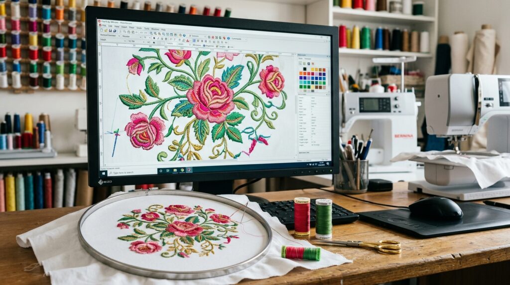
What is Digitizing? (And Why It Matters)
Embroidery digitizing is the process of converting artwork into a file that embroidery machines can understand. Think of it like translating a language—your artwork speaks design language, but embroidery machines speak stitch language. A digitizer is the translator.
The digitizer makes critical decisions:
- Which stitches go where
- How dense the stitching should be
- How to handle curves and angles
- How to incorporate multiple colors
- How to simplify complex designs for embroidery
Bad digitizing = bad patches. Good digitizing = professional results.
MISTAKE #1: Wrong Stitch Density
What Happens:
- Puckering: Fabric wrinkles under heavy stitching
- Loose stitches: Embroidery falls apart after a few washes
- Overly heavy feel: Stitches pull and stretch the fabric
- Sagging: Patch droops or distorts
- Uncomfortable wear: Stiff, scratchy patches that irritate skin
Why It Happens:
Stitch density is the number of stitches per inch (SPI). Different fabrics require different densities:
- Jersey fabric (t-shirts): Requires LOW density (4-5 SPI) because the stretchy fabric distorts easily
- Towel fabric: Requires MEDIUM density (6-8 SPI) because thick fabric can handle more
- Denim: Requires MEDIUM-HIGH density (7-9 SPI) because tight weave supports heavier stitching
- Twill: Requires MEDIUM density (6-8 SPI)
Many digitizers use generic templates with one-size-fits-all density, not adjusting for your specific fabric.
How to Fix:
- Tell your digitizer your exact fabric type. Don’t say “it’s for a shirt.” Say “it’s for 100% cotton jersey knit, medium weight, typical t-shirt material.”
- Request a sample or sew-out on YOUR actual fabric. Before ordering 1,000 patches, order 50-100 samples stitched on the exact fabric you’ll be using.
- Ask for density adjustments if needed. If samples pucker, request lower density. If stitches are loose, request higher density.
- Verify stitch count. Ask your digitizer: “What’s the total stitch count?” Typical ranges: 5,000-15,000 stitches for a 2-3″ patch. Anything significantly higher might indicate excess density.
MISTAKE #2: Too Much Detail
What Happens:
- Fine lines become thick blobs: The 1-pixel line in your design becomes a thick mass of thread
- Small text becomes illegible: You can’t read what the patch says
- Details blur together: Intricate details merge into an unrecognizable mess
- Looks nothing like original design: The finished patch is unrecognizable
Why It Happens:
Embroidery can’t recreate photorealistic artwork. A digital image can have millions of colors and pixel-perfect detail. Embroidery is limited to what thread can achieve—generally 20-30 colors maximum per patch, and details need to be bold to survive the stitching process.
Many customers and inexperienced digitizers try to force photorealistic designs directly into patches without simplification.
How to Fix:
- Simplify your design before sending to digitizer. Reduce colors (aim for 5-10 for patches). Eliminate fine details that won’t embroider well.
- Merge fine lines into bold strokes. A 1-pixel line becomes unusable. A 3-5 pixel line emborders beautifully.
- Remove intricate details. Ask yourself: “Will this be recognizable at 2 inches?” If no, simplify.
- Test on samples first. Order small sample batches (50 patches) before committing to 1,000. This shows if detail level is appropriate.
- Work with your digitizer. A good digitizer will advise: “This design is too detailed. Here’s how we can simplify it while keeping the core design.”
Real example: A customer wanted a photorealistic portrait embroidered on patches. It had hundreds of colors and intricate shading. We simplified it to 8 colors with bold strokes, removing unnecessary detail. Result: patches looked fantastic and cost 40% less.
MISTAKE #3: Minimum Text Size Ignored
What Happens:
- Text smaller than 1/4″ becomes completely unreadable
- Letters run together and become illegible
- Final patch looks like a blurry smudge where text should be
- Professional appearance destroyed by sloppy text
Why It Happens:
Your computer screen can display tiny, crisp text perfectly. Embroidery can’t. Text stitch density requires space. Text smaller than 1/4″ (0.25″) doesn’t have enough area for thread to form recognizable letters.
Inexperienced designers don’t know this limitation and include undersized text.
How to Fix:
- Text should be MINIMUM 1/4″ height (0.25 inches). Measure it. If you can’t clearly read it at that size on your monitor, it won’t embroider well.
- Larger fonts work better. Aim for 1/2″ (0.5″) or larger when possible. Easier to read, looks more professional.
- Use bold fonts. Bold sans-serif fonts (Arial, Helvetica, Verdana) embroider clearly. Thin or script fonts become illegible at small sizes.
- Avoid serifs. Serifs are thin strokes that don’t embroider well. Sans-serif fonts are industry standard for a reason.
- Use ALL CAPS. Lowercase letters have inconsistent heights and complex shapes. ALL CAPS is clearer and more professional in embroidery.
Real example: A customer wanted “Established 1974″ on a 2” patch. They used 10-point serif font. We increased to 14-point bold sans-serif ALL CAPS. Result: text became the focal point instead of an illegible smudge.
MISTAKE #4: Wrong File Format Provided
What Happens:
- File can’t be digitized at all. Digitizer has to start from scratch.
- Quality suffers. Digitizer has to recreate from low-quality source instead of working with proper artwork.
- Delays and extra costs. Rework takes time and money.
- Project timeline slips. What should be 24-hour digitizing becomes 72+ hours.
Why It Happens:
Digitizers need vector files (.AI, .EPS, .PDF with vectors) to work properly. Vector files are mathematical descriptions of your design—infinitely scalable, clean, and precise.
Raster files (JPG, PNG, BMP) are just pixels. They lose quality when enlarged and don’t contain the design information digitizers need.
Many people provide JPGs and expect perfect results, not understanding the difference.
How to Fix:
- Provide vector files (.AI, .EPS, .PDF, .SVG). These are the gold standard. Ask your designer to provide vector format.
- If vector unavailable, provide HIGH-RESOLUTION raster files. Minimum 300 DPI (dots per inch) at final size. A 2″ patch needs 600×600 pixels minimum. Anything less gets blurry.
- Ask your digitizer upfront what formats they accept. Don’t assume. Confirm before sending files.
- Test file before full project. Send one file and ask: “Can you digitize this?” Get confirmation before proceeding with order.
- Provide clean files. No extra layers, no extra colors, no embedded images. Just your clean design.
Real example: Customer sent a JPG from a website (72 DPI). We requested vector file. They couldn’t provide one. We re-created from the JPG (lower quality). Final patches weren’t bad, but would have been better with original vector file.
MISTAKE #5: Skipping Sample Testing
What Happens:
- Order 1,000 patches confidently
- First production run arrives wrong. Colors off, details blurry, sizing wrong.
- $2,000-$5,000 wasted on unusable patches
- Timeline destroyed. Now you need to reorder and delay delivery.
- Customer angry. You promised patches weeks ago.
- Reputation damaged. Your customer blames you (fairly).
Why It Happens:
Pressure to save money. Time pressure to meet deadlines. Overconfidence in digitizer (“They said it would be great, so it will be”).
People skip the safety step that costs $100-200 but saves thousands.
How to Fix:
- ALWAYS order samples first. Non-negotiable. 50-100 sample patches cost $100-300. Worth it to catch issues.
- Test on your actual fabric. Don’t test on different fabric. Test on exactly what you’ll be using for final production.
- Inspect samples carefully:
- Are colors accurate?
- Is text readable?
- Are details clear?
- Does sizing look right?
- Is stitching quality good (no loose threads)?
- Is patch comfortable to wear?
- Request revisions BEFORE full production. If samples aren’t perfect, request digitizer make adjustments and send revised samples.
- Get written approval from stakeholders. If this is for a company or organization, get sign-off from decision makers before you commit to 1,000 patches.
Real example: Fire department ordered 500 patches without samples. First production arrived with wrong colors (bright red instead of fire department’s official crimson). Cost: $1,500 wasted, deadline missed. Now they always order samples first.
MISTAKE #6: Poor Color Matching
What Happens:
- Stitched patch doesn’t match your brand colors
- Looks wrong compared to uniforms or branding
- Customer complains the colors are “off”
- Professional appearance compromised
- Customer unhappy, reputation damaged
Why It Happens:
Thread colors don’t perfectly match every Pantone color. Threads are limited to manufacturer’s color palette (maybe 600-800 colors available). Your brand might need a specific Pantone that doesn’t have a perfect thread match.
Customers often communicate color poorly: “I need red” instead of “Pantone 200C” or “fire department crimson.”
Thread colors also look different on different fabrics. Red on white fabric looks different than red on black fabric.
How to Fix:
- Provide Pantone color codes, not color names. “Red” is too vague. “Pantone 200C” is precise. Get official Pantone codes from your brand guidelines.
- Provide thread color swatch references. Ask digitizer to show thread swatches from their supplier. Physical thread samples are better than digital previews.
- Request digital proof showing actual thread colors. Before production, get a mockup showing which threads will be used for each color.
- Test on your actual fabric. Color perception changes depending on fabric. Test on exact material you’ll use.
- Accept thread color matching limitations. Thread is thread. It won’t perfectly match every Pantone. Digitizer will find the closest match.
Real example: Customer specified brand blue as “Pantone 279C.” Digitizer found the closest match thread (Pantone 280C, slightly different). Digital proof showed the difference. Customer approved. Final patches matched expectations because expectations were set correctly.
MISTAKE #7: Ignoring Fabric Type
What Happens:
- Stitches pucker on jersey fabric
- Patch is too heavy for thin, delicate fabric
- Looks wrong when worn on intended garment
- Customer unhappy—”patch doesn’t look right”
Why It Happens:
Different fabrics require different digitizing:
- Jersey (t-shirts): Stretchy, low density needed
- Twill (workwear): Stable, medium-high density OK
- Towel fabric: Thick, can handle higher density
- Denim: Tight weave, higher density OK
- Silk: Delicate, requires LOW density
Many digitizers don’t ask about fabric or use generic settings for all fabrics.
How to Fix:
- Tell digitizer exactly where patch will be sewn. “This will be embroidered on cotton jersey t-shirt material” is clear. “It’s for apparel” is vague.
- Provide sample of your fabric. Send digitizer a swatch of the actual fabric if possible. They can test on it.
- Request sample/sew-out on your exact fabric. Before full production, ensure stitching works on your fabric.
- Ask digitizer for recommendations. Good digitizers will say: “For jersey, we recommend lower density to prevent puckering. Here’s what we recommend…”
- Get professional guidance. If unsure, ask your digitizer: “What density/stitch settings do you recommend for [your fabric]?”
MISTAKE #8: Excessive Stitch Count
What Happens:
- Patch is heavy, stiff, uncomfortable to wear
- Stitches pull and bunch
- Expensive to produce (more thread = higher cost)
- Patch looks over-stitched, amateur
- Takes longer to produce (more stitches = more machine time)
Why It Happens:
Inexperienced digitizers don’t optimize. They think “more stitches = better quality.” Wrong. Optimized digitizing uses the minimum necessary stitches to achieve quality.
Generic templates often have excessive stitches because they’re not customized to your specific design.
How to Fix:
- Ask digitizer: “What’s the total stitch count?” Before approving design, know the stitch count. Typical range for 2-3″ patch: 5,000-15,000 stitches.
- Request optimization for your budget. Tell digitizer your stitch count target. They can optimize to hit it.
- Understand the trade-off. Simple designs = fewer stitches = lower cost + lighter patch. Complex designs = more stitches = higher cost + heavier patch.
- Ask for alternatives. If stitch count is high, ask: “Can we simplify the design to reduce stitch count?” Often the answer is yes.
- Benchmark against quality makers. Get quotes from 2-3 digitizers. Compare stitch counts for same design. Wide variance indicates one digitizer isn’t optimizing.
MISTAKE #9: Bad File Preparation
What Happens:
- Files have missing fonts (text converts wrong)
- Artwork is sloppy (digitizer has poor source material)
- Files are corrupted (won’t open)
- Digitizing takes longer (digitizer has to fix your files)
- Quality suffers (digitizer working with bad source)
Why It Happens:
Customers don’t understand how to prepare files for professional use. They send what they have without thinking about whether it’s suitable.
How to Fix:
- Convert all text to curves before sending. If your design has text, convert it to outlines/curves in your design software. Otherwise, digitizer might not have the font.
- Use clean, professional artwork. Remove all extra layers, hidden objects, and unnecessary elements. Send only what you want digitized.
- Save files in correct format. Vector files should be .AI, .EPS, or .PDF. Not .PSD or .TIF.
- Use appropriate file size. Files under 50MB are fine. Huge files get slow and might corrupt.
- Send test file first. Before sending entire project, send one file and ask: “Can you open this? Is this the right format?” Get confirmation.
- Include a mockup or reference. Send your artwork PLUS a visual reference (screenshot, PDF mockup) showing how it should look.
MISTAKE #10: Choosing Cheap Over Quality
What Happens:
- Cheap digitizing = poor results
- Bad-looking patches damage your reputation
- Customer complaints about quality
- Money wasted anyway (you need to reorder from quality digitizer)
- Timeline destroyed (rework delays everything)
- Reputation damage (customer blames you)
Why It Happens:
Budget constraints feel real. A $50 digitizing job seems better than $150. Until you get the results and realize you paid $50 for garbage.
The math is simple: $100 for quality digitizing saves you $3,000 in wasted patches.
How to Fix:
- Invest in quality digitizing. Good digitizers cost more because they’re better. That’s how quality works.
- Consider long-term ROI. Your reputation is worth more than $100. Cheap digitizing damages it.
- Get quotes from 2-3 digitizers. Compare not just price, but experience, portfolio, communication, guarantees.
- Choose based on quality, not price. Pick the digitizer who will deliver best results, not cheapest price.
- Ask for references. Quality digitizers have happy customers who’ll recommend them.
How to Choose a Digitizer: Your Evaluation Checklist
Portfolio Review
- Look at projects similar to yours
- Check quality and attention to detail
- Are designs clear and professional?
- Ask: “What challenges did you face with similar projects?”
Communication Test
- How quickly do they respond to emails?
- Can they explain their digitizing process?
- Do they ask smart questions about YOUR project?
- Do they seem interested or just transactional?
Sample Evaluation
- Ask if they offer sample services
- Order small sample (50-100 patches)
- Test on your actual fabric
- Inspect closely for quality and detail
- Request unlimited revisions until happy
Red Flags—Avoid These:
- “Overnight turnaround offered” (too fast = rushed work)
- “Can’t explain their process” (lack of expertise)
- “No sample option available” (hiding quality issues)
- “Only use templates” (not custom work)
- “No revision policy” (inflexible, difficult to work with)
- “Cheapest price in the market” (usually reflects quality)
Gem Punch’s Digitizing Approach
We’ve been digitizing patches since 2012. Here’s how we do it differently:
Expert digitizers with 13+ years experience: Our team understands embroidery limitations and possibilities. We know what works and what doesn’t.
Every file customized to YOUR specs: No templates. No generic approach. We customize stitch density, color selection, and detail level for your specific fabric and design.
Digital proofs before production: You see exactly how your patch will look (thread colors and all) before we start embroidering.
Unlimited revisions included: Want adjustments? No problem. We revise until you’re completely happy. No surprise revision charges.
Sew-out testing on your actual fabric: Before production, we test-stitch on the exact fabric you’ll be using. Catches issues early.
24-48 hour digitizing turnaround: Fast without sacrificing quality.
Focus on YOUR project, not templates: We care about your success, not just completing work.
Frequently Asked Questions
How long does digitizing typically take? 24-48 hours for most projects. Rush services (12-24 hours) available.
Can I revise the digital file after receiving proof? Yes. Unlimited revisions are standard. We adjust until you’re completely happy.
Do you digitize simple designs? Yes, any complexity level. Simple designs often digitize faster and cost less.
What file formats can you work with? Vector files preferred (.AI, .EPS, .PDF). We also work with high-res raster files (300 DPI minimum).
How much does digitizing cost? Depends on complexity. Often included free with patch orders. Standalone digitizing typically $25-$150 per design.
Can you simplify my overly complex design? Yes. We’ll advise on what will and won’t work in embroidery, then recommend simplifications while keeping the core design.
What’s included with digitizing? Digital proof, unlimited revisions, sew-out testing on your fabric, final digitized file in multiple formats.
Conclusion
Embroidery digitizing is where your vision becomes reality. Good digitizing means professional patches that exceed expectations. Bad digitizing means wasted money and disappointed customers.
Avoid these 10 mistakes:
- Wrong stitch density (specify your fabric)
- Too much detail (simplify for embroidery)
- Undersized text (minimum 1/4″ height)
- Wrong file format (provide vectors)
- Skipping samples (test before full production)
- Poor color matching (use Pantone codes)
- Ignoring fabric type (specify where patch goes)
- Excessive stitch count (ask for optimization)
- Bad file prep (clean, professional files)
- Choosing cheap over quality (invest in good work)
Need expert digitizing for your patches?
Get Your Free Quote Today — Our expert digitizers will evaluate your design, advise on best approach, and deliver professional results.
Related Resources
- Complete Guide to Embroidery Digitizing — Deep dive into digitizing process, techniques, and optimization
- Custom Patches Service Page — Order patches with expert digitizing included
- Vector Art for Embroidery — Prepare artwork properly for digitizing
- Patch Care & Maintenance — Keep your patches looking professional