You’re sitting in front of your computer, trying to design a patch.
You have an idea. You’ve got colors in mind. You know generally what you want it to look like.
But you don’t know patch design principles, when you mock it up, something feels off. It doesn’t look as professional as you imagined. The text is hard to read. The colors don’t pop. The overall composition feels amateur.
Here’s the thing: great patch design isn’t magic. It’s not talent that some people have and others don’t.
It’s understanding specific design principles that work for patches. Because patch design has unique constraints—your design will be viewed at arm’s length, created with embroidery thread, and needs to communicate instantly.
This guide walks you through the fundamental design principles that separate professional patches from amateur ones. Apply these principles and your designs will look significantly better.
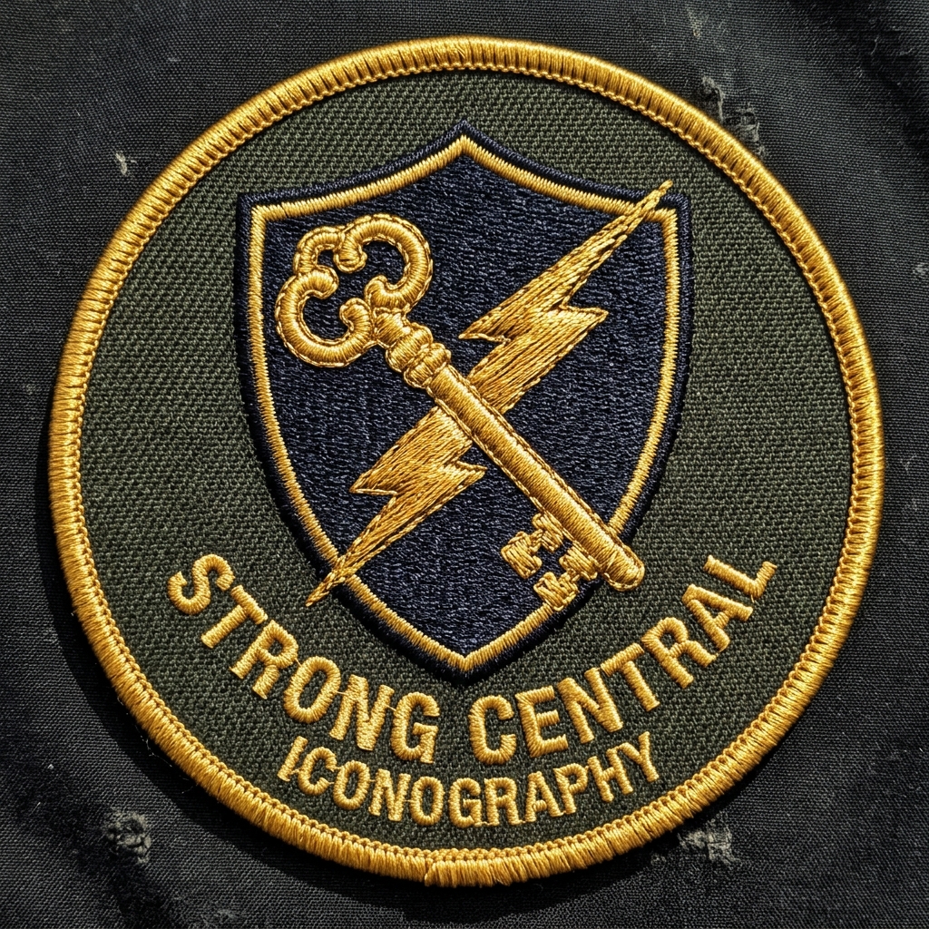
The Core Problem With Patch Design (Why Most Fail)
Before we talk about what works, let’s talk about what doesn’t.
I’ve reviewed hundreds of patch designs. The amateurs all make the same mistakes:
Too many colors. 7-8 colors looks cool on your computer. When embroidered, it’s muddy and complex.
Too much detail. Fine lines and intricate shapes disappear when stitched. Small details become visual noise.
Low contrast. Your colors look good together to you, but when viewed from 5 feet away, they blend together and become unreadable.
Unclear hierarchy. Everything is equally important, so nothing stands out. No focal point.
Text too small. Looks fine on screen. Illegible when embroidered on a 3-inch patch.
Fonts that don’t work. Script fonts, thin fonts, ornate fonts—all look terrible when stitched into thread.
Composition that’s cluttered. Every inch of space filled. No breathing room. Looks amateur.
The good news? Understanding these problems is halfway to fixing them.
Design Principle #1: Color Theory — Choose Colors That Work
Understanding Color Psychology
Color isn’t random. Colors communicate.
Red says: energy, urgency, passion, danger, stop
Blue says: trust, professional, calm, stability, corporate
Green says: growth, nature, fresh, eco-friendly, healthy
Yellow says: optimism, energy, caution, warmth, happiness
Orange says: creativity, enthusiasm, warning, activity, fun
Purple says: luxury, creativity, wisdom, mystery, premium
Black says: professional, power, sophisticated, elegance, formal
White says: clean, simple, modern, fresh, space
Gold says: premium, luxury, achievement, success, high-end
Silver says: modern, sophisticated, tech, sleek, contemporary
When designing a patch, ask yourself: What do I want this patch to communicate? Choose colors that reinforce that message.
Example: Security company patch should use blue (trust, professional) not orange (fun, casual).
The Color Harmony Approach
Not all colors work together. Some combinations are beautiful. Others clash.
Complementary colors — Opposite on color wheel
- High contrast, vibrant, eye-catching
- Example: Blue + Orange
- Use when: You want maximum visual impact
- Watch out: Can be overwhelming if not balanced
Analogous colors — Adjacent on color wheel
- Harmonious, subtle, cohesive
- Example: Blue + Purple + Green
- Use when: You want sophisticated, professional look
- Watch out: Can look bland if not enough contrast
Triadic colors — Equally spaced on color wheel
- Balanced, dynamic, vibrant but not chaotic
- Example: Blue + Red + Yellow
- Use when: You want both balance and energy
- Watch out: Requires skill to not overdo
Monochromatic — Variations of single color
- Cohesive, professional, sophisticated
- Example: Light blue + medium blue + dark blue
- Use when: You want clean, professional, minimalist look
- Watch out: Can look boring without proper contrast
For patches specifically: Complementary colors work best. High contrast = readable from distance.
The Color Limitation Reality
Here’s a constraint unique to patch design: embroidery has thread color limitations.
You can’t create every color that exists. You’re limited to thread colors a manufacturer has in stock.
Practical limit: 3-5 colors maximum per patch
Why?
- 1-2 colors: Looks basic, no visual interest
- 3-5 colors: Sweet spot (professional, interesting, cost-effective)
- 6-10 colors: Expensive, complex, harder to read
- 10+ colors: Impractical (poor quality, extremely expensive)
Real cost impact:
- 3-color patch: $1.50/patch
- 5-color patch: $2.00/patch
- 8-color patch: $3.50/patch
More colors = significantly more expensive. Smart designers stay in the 3-5 color range.
Choosing Your Palette Strategically
Step 1: Decide on primary color
- This is your main brand color
- Should reflect your brand identity
- Examples: Navy blue, forest green, burgundy
Step 2: Choose 1-2 accent colors
- Support the primary color
- Create contrast and interest
- Examples: Gold accent on navy, white on dark colors
Step 3: Test contrast
- Print your color palette
- View from 10 feet away
- Can you see each color clearly?
- If not, increase contrast
Step 4: Verify thread availability
- Confirm your manufacturer has thread in those colors
- Some Pantone colors don’t exist in thread
- Check before finalizing design
Design Principle #2: Contrast — Make It Readable From Distance
Why Contrast Matters More Than You Think
Patches are viewed at arm’s length. Sometimes from across the room.
Low contrast designs become visual mush. You can’t read text. Graphics blend together. The patch looks amateurish.
High contrast designs communicate instantly. Clear, professional, readable.
Test: Squint at your design. If you can’t see the elements when you squint, contrast is too low.
Types of Contrast
Color contrast — Dark vs. light (most critical for embroidery)
- Example: White logo on dark blue background
- Example: Black text on yellow background
- This is what matters most for patches
Value contrast — Light vs. dark regardless of hue
- Example: Light gray vs. dark gray (even without color difference)
- Matters when color alone isn’t enough
Saturation contrast — Bright vs. muted
- Example: Bright red next to muted brown
- Adds interest beyond just light/dark
Size contrast — Large vs. small elements
- Example: Large logo, small text
- Creates visual hierarchy
For patches: Focus on color contrast (light vs. dark).
High Contrast vs. Low Contrast Examples
HIGH CONTRAST (Professional):
- White logo on dark blue background ✓
- Dark logo on light yellow background ✓
- Bright color on black background ✓
LOW CONTRAST (Amateurish):
- Light gray logo on white background ✗
- Dark blue logo on dark purple background ✗
- Muted color on similar muted color ✗
Quick test: View your design at 50% brightness on your screen. If you still see it clearly, contrast is good.
Checking Contrast (The Professional Way)
Use online tools:
- Google “color contrast checker”
- Enter your two colors (foreground/background)
- Check if it passes WCAG AA standard (recommended for design work)
- Aim for contrast ratio of 7:1 or higher (very easy to read)
Alternative test:
- Print design in black and white
- Can you see all elements clearly?
- If yes, color contrast is adequate
Design Principle #3: Composition — Organize Elements Professionally
Visual Hierarchy: Guide the Eye
When someone looks at your patch, what should they notice first?
That’s your primary element. Your visual hierarchy.
Hierarchy levels:
- Primary element (most important) — Logo, main graphic
- Secondary elements (supporting) — Text, smaller graphics
- Tertiary/background (least important) — Background color
Why it matters: If everything is equally important, nothing stands out. Confusion results.
How to create hierarchy:
- Size: Make primary element larger
- Color: Make primary element brighter/more vibrant
- Placement: Center or emphasize primary element
- Simplicity: Primary element should be simpler/bolder
Example: Company logo (primary) should be larger and more prominent than company name (secondary).
Composition Rules That Work
Rule of Thirds: Divide your space into thirds (both horizontal and vertical). Place important elements at intersection points.
- More visually interesting than pure center
- Used in professional design constantly
- Creates natural, balanced composition
Balance: Visual weight distributed evenly
- Symmetrical: Mirror image (formal, professional, stable)
- Asymmetrical: Unequal but visually balanced (dynamic, interesting, modern)
Emphasis: Your focal point stands out
- Can’t be ambiguous
- Needs to be immediately clear
White space (Negative space): Breathing room around elements
- Prevents cluttered appearance
- Makes design feel professional
- Critical for legibility
Alignment: All elements align to invisible grid
- Everything intentional, nothing random
- Creates organized, professional appearance
Composition Examples
Good patch composition:
- Logo center or center-left (primary)
- Company name below logo (secondary)
- Background color unifies (tertiary)
- Clear focal point (logo)
- Breathing room around elements
- Professional appearance
Poor patch composition:
- 5 different graphics competing
- Text and logo same size (unclear what’s important)
- No clear focal point
- Cluttered, every inch used
- Random placement
- Amateur appearance
Design Principle #4: Typography — Font Selection for Embroidery
Fonts That Work for Embroidery
Not all fonts work when embroidered. Some fonts look great on screen but terrible when stitched.
Best fonts for embroidery:
Sans-serif fonts (no decorative lines)
- Arial, Helvetica, Futura, Gotham
- Clean, modern, legible
- Work great when embroidered
- Recommended for patches
Bold weight fonts (thicker strokes)
- Regular or bold weight best
- Thin fonts disappear when stitched
- Font weight matters more than you think
Simple letterforms (no unnecessary complexity)
- Geometric, clear shapes
- No intricate details
- Everything readable
Fonts to AVOID for embroidery:
Script/handwriting fonts ✗
- Too ornate, details disappear
- Illegible when stitched
- Looks unprofessional on patches
Thin fonts ✗
- Disappear when embroidered
- Too delicate for thread
- Not suitable for patches
Serif fonts with small serifs ✗
- Serifs disappear entirely
- Looks wrong when stitched
- Choose sans-serif instead
Overly decorative fonts ✗
- Complexity is lost
- Details become visual noise
- Unprofessional appearance
Text Sizing for Readability
Minimum text height: 3/8 inch (readable but tight)
Comfortable: 1/2 inch (easy to read)
Large/bold: 3/4 inch (very readable)
Rule: Larger text = better readability when embroidered. Minimum should be 1/2 inch for any important text.
Example: “Est. 2024” at 3/8 inch is readable but small. At 1/2 inch, it’s comfortable.
Text Placement Best Practices
Best placement: Bottom of patch (natural reading direction)
Acceptable: Along curved edges (if large enough to read)
Avoid: Diagonal text (hard to read), vertical text (unnatural), too small (illegible)
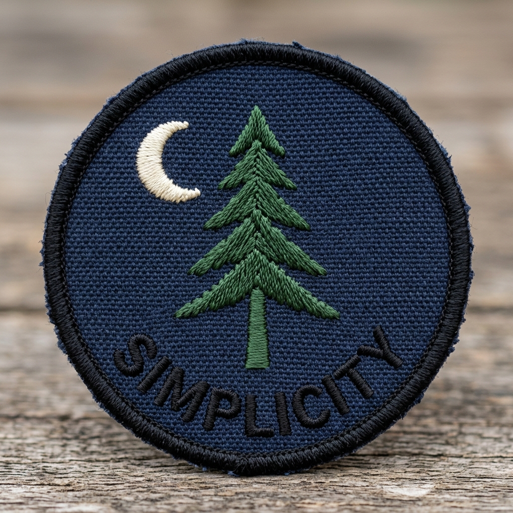
Design Principle #5: Simplicity — When Less Is More
The Simplicity Principle
Here’s something that surprises many first-time patch designers:
Complex designs look cheap. Simple designs look professional.
Why? Because patches are viewed from distance (5-10 feet away). Complex detail disappears. You’re left with visual confusion.
Simple design is clear. Professional. Memorable.
Why Complexity Fails
Problem #1: Fine detail disappears
- Small lines become thick blobs
- Intricate shapes become unreadable
- Intent is lost
Problem #2: Too many colors become muddy
- Individual colors blend together
- Overall impression: confused, amateur
Problem #3: Visual noise
- Too many elements competing
- No clear message
- Hard to remember
Simplification Strategies
Strategy #1: Reduce element count
- Fewer shapes = clearer message
- One focal point = strong design
- Remove anything that doesn’t serve purpose
Strategy #2: Reduce color count
- Stick to 3-5 colors (not 8-10)
- Eliminate unnecessary hues
- Better contrast results from limitation
Strategy #3: Increase size of key elements
- Make logo bigger
- Make text bigger
- Reduces need for fine detail
Strategy #4: Remove unnecessary detail
- Eliminate small lines
- Simplify complex shapes
- Round corners instead of complex angles
- If detail disappears at distance, remove it
Rule of thumb: If you can’t describe your design in one sentence, it’s too complex.
The Patch Design Checklist: Before You Finalize
Use this checklist to verify your design is ready:
Color & Contrast
- ☐ Using 3-5 colors maximum?
- ☐ High contrast between colors?
- ☐ Colors match brand identity?
- ☐ Test from distance: Still readable?
Typography
- ☐ Using sans-serif font?
- ☐ Font weight is bold or regular (not thin)?
- ☐ Text minimum 1/2″ height?
- ☐ Text placement is professional?
Composition
- ☐ Clear primary element (focal point)?
- ☐ Clear visual hierarchy?
- ☐ Balanced composition?
- ☐ Adequate white space?
Simplicity
- ☐ No unnecessary detail?
- ☐ Can describe in one sentence?
- ☐ Elements work at arm’s length?
- ☐ No complexity that disappears?
Professional Quality
- ☐ Looks professional overall?
- ☐ Would represent brand well?
- ☐ Would stand out on uniform?
- ☐ Worth creating in embroidery?
If you checked all boxes: Design is ready for digitizing.
Real-World Example: Good Design vs. Poor Design
Example #1: Security Company Patch
GOOD DESIGN:
- Shield logo (professional symbol)
- Company name below
- Dark blue background (trust, professional)
- White text (high contrast)
- 3 colors total
- Legible at distance
- Professional appearance
POOR DESIGN:
- Shield with added decorative elements
- 7 colors (muddy when embroidered)
- Small company name (illegible)
- Thin font (disappears)
- Lots of shading/texture
- Looks amateurish when embroidered
Example #2: Sports Team Patch
GOOD DESIGN:
- Team name bold and large (primary)
- Mascot/symbol as supporting graphic
- Two accent colors (team colors)
- Year in small text
- Clean composition
- High contrast
POOR DESIGN:
- Multiple graphics competing
- Text and mascot same size (unclear priority)
- 5-6 colors (chaotic)
- Overly complex mascot design
- Small text (unreadable)
- Cluttered appearance
Common Design Mistakes (And How to Avoid Them)
Mistake #1: Using Logo as-Is Without Modification
Problem: Logo designed for web/print, not embroidery
Result: Fine details disappear, colors too many, text too small
Solution: Simplify logo for embroidery—remove detail, reduce colors, enlarge text
Mistake #2: Trying Too Many Colors
Problem: Want to match brand’s full palette (8+ colors)
Result: Expensive, muddy, unclear
Solution: Choose primary color + 1-2 accents. Limit to 3-5 total.
Mistake #3: Text Too Small
Problem: “Looks fine on screen”
Result: Illegible when embroidered
Solution: Minimum 1/2″ height. Test at distance.
Mistake #4: Choosing Wrong Font
Problem: Script or thin font (looks cool on screen)
Result: Disappears or becomes illegible when stitched
Solution: Use bold sans-serif fonts only.
Mistake #5: Busy, Cluttered Composition
Problem: Using all available space, no breathing room
Result: Looks amateur, lacks professionalism
Solution: Leave white space. Simplify. One focal point.
Professional Design Resources & Tools
Design Tools Available
Adobe Illustrator (Professional standard)
- Industry standard for patch designers
- Powerful, precise, professional
- Cost: $20.99/month
- Learning curve: Steep but worth it
Canva (Beginner-friendly)
- User-friendly, easy to learn
- Good templates, built-in fonts
- Cost: Free or $120/year Pro
- Learning curve: Very easy
Affinity Designer (Affordable professional)
- Professional quality, lower cost
- Good alternative to Illustrator
- Cost: $70 one-time purchase
- Learning curve: Medium
Inkscape (Free option)
- Open-source, free
- Limited but functional
- Cost: Free
- Learning curve: Steep
Recommendation: If you’re serious about patch design, invest in Adobe Illustrator or Affinity Designer. Canva works for simple designs.
When to Hire a Professional Designer
Hire a professional if:
- Your design is complex or important
- You want expert guidance on colors/composition
- You’re designing for a brand/company
- You lack design experience
- The stakes are high (custom expensive patches)
Professional designers:
- Understand patch-specific constraints
- Have embroidery digitizing experience
- Can guide you on colors/fonts/sizing
- Produce higher quality results
- Cost: Typically $200-500 for design
DIY if:
- Simple, straightforward design
- You have some design experience
- Stakes are low (personal use patches)
- You’re comfortable with tools
Professional Design Services
Get Professional Patch Design →
Gem Punch offers professional design consultation:
✓ Expert designers with patch experience
✓ Color strategy guidance
✓ Composition optimization
✓ Font selection expertise
✓ Professional quality guaranteed
✓ Unlimited revisions until perfect
We’ll help you create a design that:
- Communicates your message clearly
- Works perfectly when embroidered
- Represents your brand professionally
- Stands out on uniforms or garments
Contact for design services:
- 📞 Phone: +1 (917) 525-5737
- 💬 Live Chat: Available on our site
- 📧 Email: services@gempunch.com
Related Resources for Designers
Learn more about patch design and production:
- Complete Guide to Custom Patches — All patch information
- Professional Digitizing — Logo to stitch file conversion
- Patch Sizing Guide — Get sizing right
- How to Apply Patches — Application methods
- Heat Press vs. Sewing — Choosing method
Order patches:
- Custom Patches Service — Order patches online
FAQ: Patch Design Principles
Why do my embroidered designs look different from my original design?
Embroidery renders differently than digital design. Thin lines become thicker, fine detail disappears, colors appear different. Design specifically for embroidery constraints, not for screen display.
How many colors should my patch design have?
Optimal: 3-5 colors. This balances visual impact, cost, and legibility. Fewer than 3 looks basic. More than 5 becomes expensive and muddy.
Should I center my design or use rule of thirds?
Rule of thirds (slightly off-center) creates more visually interesting composition than pure center. Center works fine for simple designs, but rule of thirds adds professional sophistication.
Can I use a very thin font if it’s large enough?
Not recommended. Thin fonts still disappear or look wrong when embroidered, regardless of size. Use bold or regular weight instead. Your digitizer can confirm if font will work.
What if I love a font that doesn’t work for embroidery?
You have options: (1) Choose similar font that does work, (2) Have designer modify font for embroidery, (3) Use different font for your patch. Professional digitizers can often adapt fonts slightly, but bold sans-serif fonts are always safest.
Why does contrast matter more than I think?
Because patches are viewed from distance (5-10 feet away). Low contrast designs become visual mush. Colors blend together. Text becomes illegible. High contrast ensures your design communicates clearly from any distance.
Can I design a photorealistic patch?
Not with traditional embroidery. Too much detail is lost. Consider: (1) Simplify design to illustration style, (2) Use photorealistic embroidery (specialized technique, expensive), (3) Use dye sublimation patches (photo quality, different process).
How do I know if my design is too complex?
Simple test: Try to describe your design in one sentence. If you need 3+ sentences, it’s probably too complex. Also: View design at 50% zoom (simulates distance). If details disappear or become unclear, simplify.
The Bottom Line: Good Design Principles = Professional Patches
Apply these principles and your patches will look significantly better:
✓ Choose 3-5 colors strategically (not 8+ random colors)
✓ Ensure high contrast (readable from distance)
✓ Create clear visual hierarchy (one focal point)
✓ Use bold sans-serif fonts (not script or thin)
✓ Keep it simple (less is more)
✓ Leave white space (breathing room matters)
✓ Test at distance (how it actually looks)
These aren’t rules. They’re proven principles that work. Apply them and your designs will look professional.
Not confident about your design?
Tell us about your vision and we’ll review your design, give you honest feedback, and recommend improvements. No obligation—just guidance to help you succeed.